

Google has been urging business owners and webmasters for quite some time to make their websites user-friendly on mobile devices. User-friendly means several things, but it essentially boils down to usability. Google believes that websites that do not adjust screen size, font size and image pixelation for mobile devices is a bad user experience.
What is mobile-friendly?
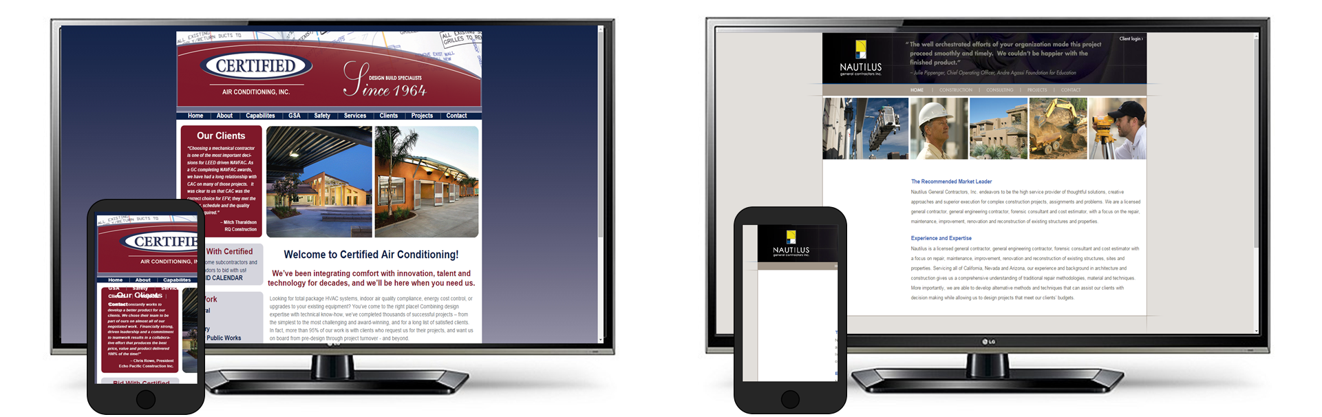
Let’s take a look at a couple examples. Below is an image of several websites with their mobile-friendly version. A really well optimized site will view nicely on all devices; a desktop, tablet and mobile phone.
Look at the two example below (you can click on them to enlarge). The first is my agency website and the second is from one of my cleints in New York City. You can see in both examples that the mobile version is very easy for consumers to get the information they need. How do you accomplish this? It’s a bit technical to explain, but not so difficult to implement. If you want more details, make an appointment with me and I’ll help you with it (by the way, there is no charge to meet with an SBDC advisor and you can meet with me as many times as you want).
You can even provide better user features on mobile than you can on a desktop version. Notice the two buttons at the top of the page for M&D? One is a Click-to-Call button and the other is a Click-to-Text. M&D makes it very easy for consumers to contact them.

Now look at the websites below. These examples were pretty easy to find, which tells me there are a lot of sites out there that are going to see their rankings in Google drop (more on that in a moment). Notice how there is no adjustment to help the consumer view the site on a smaller screen. Google considers this a bad user experience. So do I. In both examples, the desktop versions show nicely, but in mobile, the one on the left has overlapping text and doesn’t show the complete page. The one on the right is almost entirely blank. These could be fine companies, but consumers would never know it because they probably hit the back button and moved on to another contractor.
What kind of penalty can I expect?
So “penalty” may be a bit harsh. Google is not really penalizing websites, but they have said that websites that are not mobile-friendly can expect a drop in rankings. How far? It’s anyone’s guess. It depends on your market and how well most of your competitors are optimized for mobile. It is certain, however, mobile-friendly websites will rank better in mobile search and I wouldn’t be surprised if that ranking carried over to desktop as well. At the moment, search results for both versions are identical. We’ll see if that changes after the 21st.
How do I know if my site is mobile-friendly?
Google has provided a tool to help you determine how well the mobile version of your website is optimized for consumer experience. Go here to enter your website address and Google will tell you if you need to some work to make your website more mobile-friendly.
When can I expect rankings to change?
If your website is not mobile-friendly, expect it to drop in rankings on April, 21st, 2015. That’s what the industry is calling “mobilegeddon.”
How do I keep my website from losing its rank in Google?
Ask your web developer. He or she will need to get to work. If you don’t have a web developer, make an appointment with me at the SBDC as soon as possible and I will help you. We can discuss your website and your internet marketing as well. It’s all a free service to local entrepreneurs and business owners. Our contact info is in the footer of this page, but you can contact the SBDC at (619) 482-6391.